Get a Quote

NYQUEST Camp Canada

Below we have outlined many of the little details and all the thought that went in to your landing page design.

Project Showcase

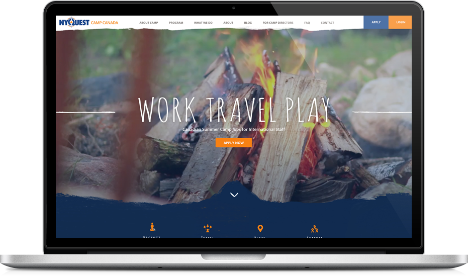
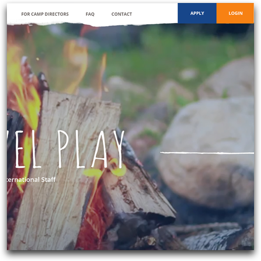
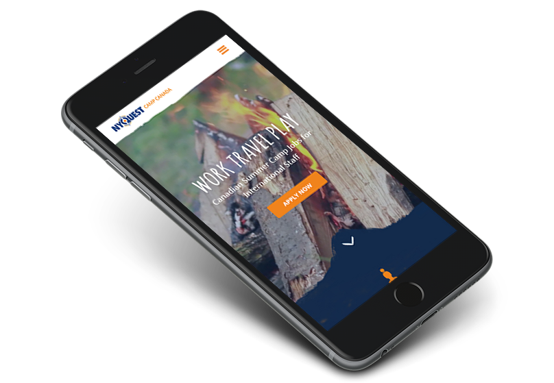
Fun Modern and Professional

Our goal with this design was to create a user interface that is not only contemporary and professional, but also easy to navigate and explore. Instead of using dull bulleted lists and blobs of text to communicate NYQUEST Camp Canada's message, our designer has created a dynamic layout that feels uncluttered while also providing an informational resource for their clients.
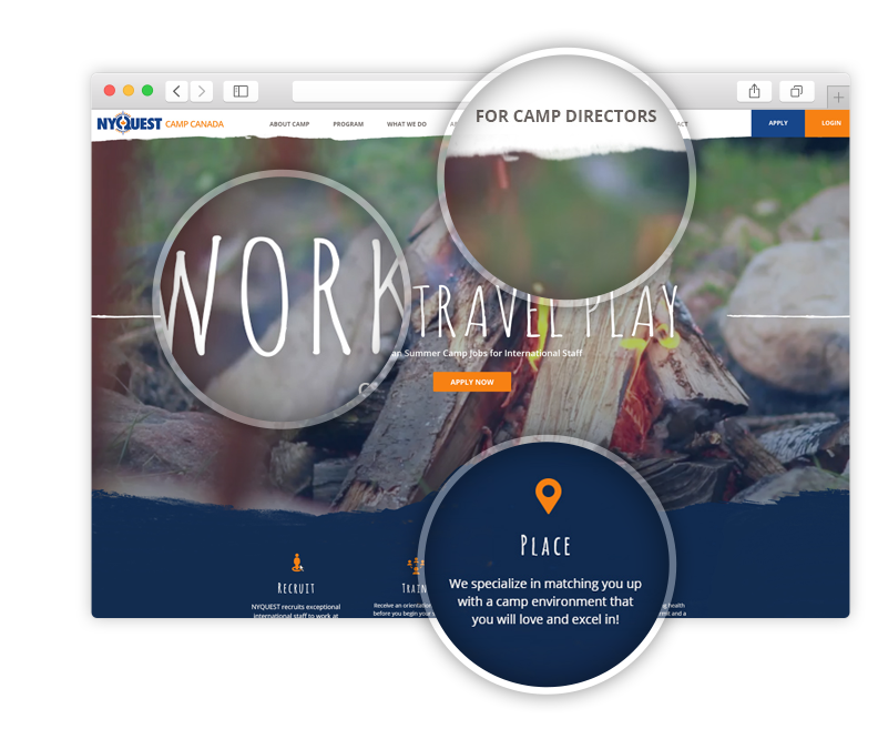
Project Image

Colour

For this mock up we opted for a simple scheme of blues and oranges keeping with NYQUEST Camp Canada's current branding.

Typography

We have selected a grounded and simple sans-serif typeface for partnered with a fun looking display font for a unique and creative look. This font is web safe and will render correctly across all browsers and platforms.

Project Image

The Responsive Advantage

A responsive design allows NYQUEST Camp Canada's interface to be more accessible to their visitors. The design stretches and forms itself to every screen size, so that every user gets the best possible experience.

Desktop

The Desktop version of the design is optimized for viewing on a laptop or a monitor. Every element of the design will become larger and more spread out or smaller and closer together depending on the specific size of the screen.

Impact

The large scale of the desktop version of the site fills the screen, making for a much more impactful and memorable impression.

Top & Main Navigation

The top of the website is optimized for ease of usability. This is where the main navigation is located to create a navigational hub for the whole site.

Call to Action Items

One of the most important functions of the home page is to direct the user where to go. This is why much of this design is dedicated to this purpose. Actionable Items in the form of content boxes, a contact form and the background video area help to inform the user and entice them to explore the site further to create conversions.

Footer Menu

In the footer is a secondary navigation to further improve the usability of the website.

Tablet

The tablet version of the design is similar to the desktop version, except that all the graphics get condensed to fit much better at the smaller resolution.

Mobile

For mobile devices, all the content moves in to a one column layout so that all the images and text can remain large enough to be seen on a much smaller screen. Also many functionalities have been simplified for a touch interface, such as the main navigation.

Get a Free Quote

Request a free proposal from Geek Power Web Design and get started on your new website today!

We see every new project as an opportunity to indulge our passion for web design and web development. We truly love what we do and we're always excited to start a new website!

@
Geek Power - Toronto Web Design