Get a Quote

PI Creative

Below we have outlined many of the little details and all the thought that went in to your landing page design.

Project Showcase

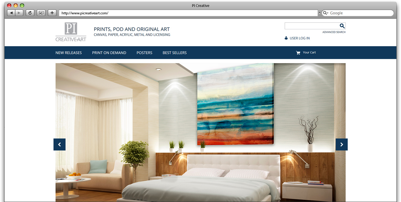
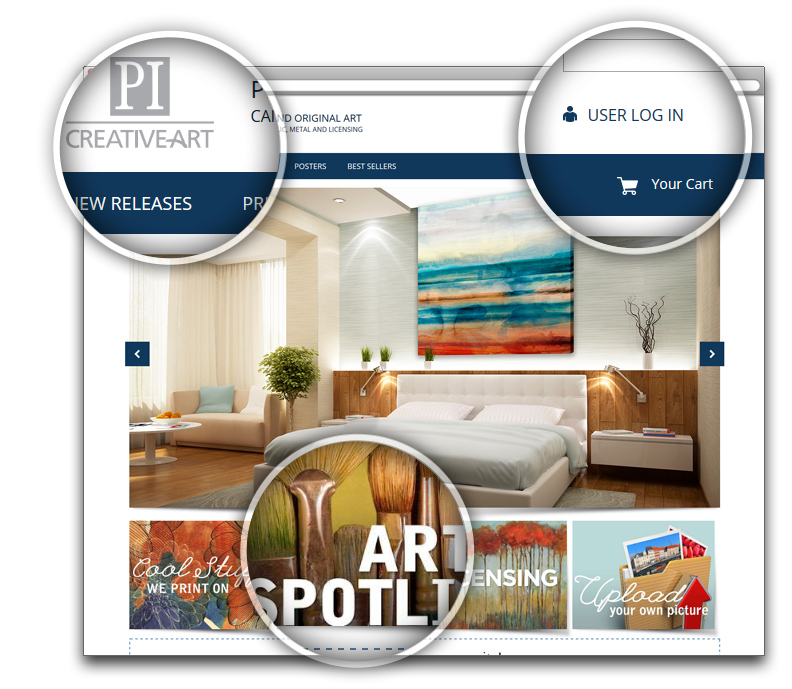
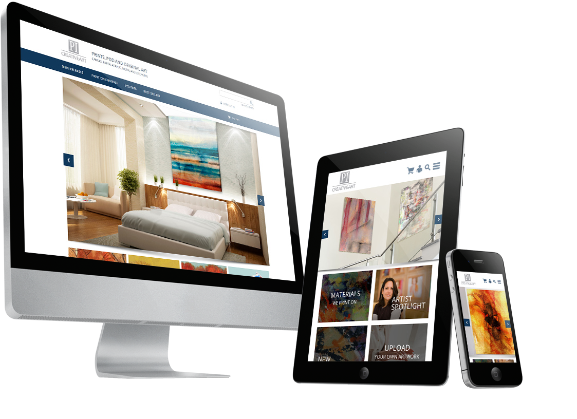
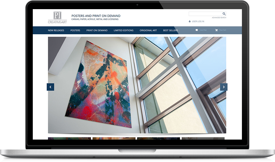
Simple and Clean Cut

The with this design was to create a user interface that is not only contemporary and professional, but also easy to navigate and explore, and feature beautiful artwork.
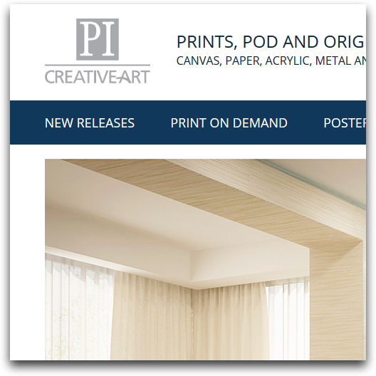
Project Image

Colour

The colors in this design are utilizing light greys and dark blue hues to reflect PI Creative branding.

Typography

We have selected a grounded and simple sans-serif typeface for all the type on the design for a terse look. This font is web safe and will render correctly across all browsers and platforms.

Project Image

The Responsive Advantage

A responsive design allows PI Creative's interface to be more accessible to their visitors. The design stretches and forms itself to every screen size, so that every user gets the best possible experience.

Desktop

The Desktop version of the design is optimized for viewing on a laptop or a monitor. Every element of the design will become larger and more spread out or smaller and closer together depending on the specific size of the screen.

jQuery

jQuery is the perfect way to communicate the services available to PI Creative's clientele, while adding subtle movement to the design.

Top & Main Navigation

The top of the website is optimized for ease of usability. This is where the main navigation is located to create a navigational hub for the whole site.

Contact Form

To the right of the jQuery rotator is a email contact form. This form allows PI Creative's clients to feel more informed and secure while also being a good way to collect information for sales.

Actionable Items

One of the most important functions of the home page is to direct the user where to go. This is why much of this design is dedicated to this purpose. Actionable Items in the form of content boxes, a contact form and the jQuery rotator help to inform the user and entice them to explore the site further to create conversions.

Footer Menu

In the footer is a secondary navigation to further improve the usability of the website.

Tablet

The tablet version of the design is similar to the desktop version, except that all the graphics get condensed to fit much better at the smaller resolution.

Mobile

For mobile devices, all the content moves in to a one column layout so that all the images and text can remain large enough to be seen on a much smaller screen. Also many functionalities have been simplified for a touch interface, such as the main navigation.

In Conclusion

We believe that this design gives [COMPANY NAME] a modern and professional web presence which is sure to leave a memorable impression on their clients. This is a design that breaks the mold and isn't afraid to be bold without sacrificing on usability. If you have any questions, please contact our Creative Director.

Downloads

Get a Free Quote

Request a free proposal from Geek Power Web Design and get started on your new website today!

We see every new project as an opportunity to indulge our passion for web design and web development. We truly love what we do and we're always excited to start a new website!

@
Geek Power - Toronto Web Design