Get a Quote

Canadian Made Fabrics

Below we have outlined many of the little details and all the thought that went in to your landing page design.

Project Showcase

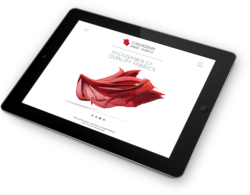
An Open Concept Feel

Our goal with this design was to create a user interface that is not only contemporary and professional, but also easy to navigate and explore. Instead of using dull bulleted lists and blobs of text to communicate Canadian Made Fabrics' message, our designer has created a dynamic layout that feels uncluttered.

Project Image

Colour

For this mock up we opted for a simple scheme of [THE ACCENTED COLOURS]. However, colour is very flexible and Geek Power would be happy to try some other colour schemes too. Colour can very drastically change the mood of a design, so we advise to consider it.

Typography

We have selected a grounded and simple sans-serif typeface for all the type on the design for a terse look. This font is web safe and will render correctly across all browsers and platforms.

Project Image

The Responsive Advantage

A responsive design allows Canadian Made Fabrics' interface to be more accessible to their visitors. The design stretches and forms itself to every screen size, so that every user gets the best possible experience.

Desktop

The Desktop version of the design is optimized for viewing on a laptop or a monitor. Every element of the design will become larger and more spread out or smaller and closer together depending on the specific size of the screen.

jQuery

jQuery is the perfect way to communicate the services available to Canadian Made Fabrics' clientele, while adding subtle movement to the design.

Logomark

Our designer created this logomark for the brand. It's crisp, clean lines and classic typography lend do a contemporary look rooted in a established corporation. Like the website as a whole, the colours used in this logomark can be altered for a very different feel.

Top & Main Navigation

The top of the website is optimized for ease of usability. This is where the main navigation, including the drop down menu functionality is located to create a navigational hub for the whole site.

Tablet

The tablet version of the design is similar to the desktop version, except that all the graphics get condensed to fit much better at the smaller resolution.

Mobile

For mobile devices, all the content moves in to a one column layout so that all the images and text can remain large enough to be seen on a much smaller screen. Also many functionalities have been simplified for a touch interface, such as the main navigation.

Get a Free Quote

Request a free proposal from Geek Power Web Design and get started on your new website today!

We see every new project as an opportunity to indulge our passion for web design and web development. We truly love what we do and we're always excited to start a new website!

@
Geek Power - Toronto Web Design